Blue and Navy Kitchen Ideas: A Colour-Led Design Guide
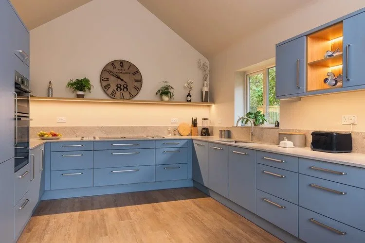
Blue has a long and well-established place in kitchen design, and it is not hard to understand why. It is one of the few colours that works convincingly across a very wide range of styles and settings, from deep navy on a full handleless run in a contemporary open-plan kitchen to a pale coastal blue on a painted shaker in a period cottage. These are real blue kitchen ideas drawn from genuine Kitchen Store projects across Sussex and Surrey, including two in Horsham, showing how the palette performs across different homes, rooms and briefs.
Navy and Dark Blue Kitchen Ideas
Navy is the most confident version of blue in a kitchen and the one that produces the most architecturally striking results. Used across a full run of base and tall cabinets, it reads as a single, composed surface rather than a collection of individual doors. That quality makes it particularly effective in open-plan kitchens where the cabinetry is visible from the living or dining end of the room at all times.
Navy on a full run
A full navy kitchen works best in rooms with good ceiling height and strong natural light, particularly south or east facing rooms. The key is contrast: a pale worktop in white quartz or light stone prevents the navy from feeling heavy, and warm metals in the fittings and tap bring the temperature of the scheme up. Without those counterweights, a full dark blue run in a smaller or north-facing room can make the space contract noticeably.
Navy on an island or tall cabinet bank
For homeowners who want to introduce navy without committing the whole kitchen to a strong colour, using it on the island alone or on a bank of tall cabinets at one end of the run is the most accessible starting point. The navy reads as a deliberate statement piece against lighter surrounding cabinetry, and it gives the room visual depth and a clear anchor point. This approach also works well in a kitchen diner where the island marks the boundary between the cooking and dining zones.
Stopping dark blue from feeling heavy
Worktop: pale quartz, white stone or a light marble-effect porcelain provides the contrast that stops navy from closing a room down. A dark worktop on a dark cabinet run is a combination that needs very deliberate lighting to work.
Metals: brushed brass, copper and aged gold sit naturally alongside navy and warm the scheme considerably. Satin nickel and chrome are cooler pairings that read as more urban and contemporary.
Upper cabinets: keeping wall-level cabinets in a lighter shade, white, cream or pale grey, opens up the upper half of the kitchen and prevents the full room from feeling dark.
Navy and Copper Kitchens: A Combination That Works
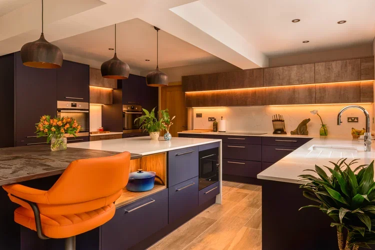
The pairing of navy blue cabinetry with copper fittings is one of the most distinctive and sustained combinations in contemporary kitchen design, and it is one where The Kitchen Store has a particularly strong body of work. Our blue and copper kitchen in Horsham is the clearest example: a full navy handleless run with copper tap, handles and pendant lighting that brings warmth to what would otherwise be a very cool palette. The copper does not need to be everywhere to work. A tap, a pendant above the island and perhaps an open shelf bracket are enough to establish the combination.
What makes navy and copper work when other strong colour and metal combinations can feel forced is the temperature relationship between them. Navy is a cool, receding colour; copper is warm, reflective and advancing. The two pull in opposite directions in a way that creates tension and visual interest without the scheme feeling unresolved. A pale quartz worktop and light flooring keep the rest of the room neutral so the combination reads clearly.
Light Blue and Soft Blue Kitchen Ideas
At the softer end of the blue family, pale and dusty blues bring a calm, airy quality that works particularly well in coastal settings and in period homes where a strong colour statement would feel out of place. Our soft blue kitchen in Ferring draws on the coastal character of its setting with a pale blue-grey shaker finish, natural oak detailing and a relaxed, unfussy approach to hardware that suits the brief. The result is a kitchen that reads as part of the house rather than a designed installation that has been dropped into it.
If soft and pale blues are the direction you are considering, our pastel kitchen ideas post covers the wider soft-colour palette in more detail, including how pale blues sit alongside other muted tones.
Blue Shaker Kitchens and Classic Blue Cabinet Designs
Blue on a painted shaker door is one of the most natural pairings in kitchen design. The recessed panel of the shaker profile gives a painted blue shade more depth and texture than a flat slab door, and the style sits comfortably in a very wide range of home types, from Victorian terraces to new builds, from small kitchen diners to large open-plan floors. Our blue and grey shaker kitchen in Horsham is a strong example of how blue and grey work together in a two-tone shaker layout: blue on the base cabinets, a complementary grey on the wall cabinets and tall cabinets, with a pale quartz worktop linking the two.
Blue and grey two-tone kitchens
Blue and grey is one of the most reliable two-tone combinations in a shaker kitchen because the two colours share enough coolness to read as a family while the contrast between them is clear enough to give the room visual interest. The most common approach is the stronger blue on the base and island cabinets, with a softer or more neutral grey on the uppers. Reversing that, grey below and blue above, is less common but works well in rooms where there is good light across the whole height of the kitchen.
Blue with brass in a shaker kitchen
Brass hardware alongside blue cabinetry is a pairing that has appeared consistently across classic British kitchen design for good reason. Unlacquered or brushed brass cup handles and bar handles warm up the coolness of the blue and give the kitchen a considered, slightly traditional quality that suits shaker profiles particularly well. Our British kitchens range includes a number of shaker options well suited to this kind of blue and brass combination.
Pairing Blue Cabinets with Worktops, Metals and Finishes
Worktop pairings
The worktop is the most important pairing decision in a blue kitchen. Pale quartz is the most versatile option because it provides contrast without competing and its cool undertones sit naturally alongside both navy and softer blues. Light natural stone, limestone and marble in particular, adds warmth and texture. Warm wood worktops work well with softer, coastal blues but can feel incongruous alongside very deep navy, where the warmth of the timber can fight the coolness of the cabinet colour. For a full comparison of worktop options, see our kitchen worktop guide and the worktop materials page.
Door finishes for a blue kitchen
Anti-fingerprint doors are the best practical choice in a blue kitchen, particularly in the deeper navy and dark blue shades where marks are most visible. Matt and timber-effect finishes are the next most forgiving options and produce the most considered results. Gloss is available across the range but is less commonly chosen now and needs more regular maintenance to look its best. Handleless blue cabinets are available across the Nolte kitchens range, not limited to any single collection.
Blue and white kitchens
Blue and white is one of the most enduring colour combinations in interior design and it translates naturally into the kitchen. White walls, white worktops and white splashback tiles alongside blue cabinetry give the room a freshness and clarity that suits both contemporary and classic styles. The ratio matters: a kitchen that is predominantly blue with white as a relief colour reads as a blue kitchen; one that is roughly half and half can look undecided. Committing to one as the dominant colour and using the other as a contrast gives a cleaner result.
Choosing the Right Blue for Your Room
Blue is a broader family than it first appears, and the shade that looks right in a showroom or on a screen will not always read the same way in your specific kitchen. A few practical considerations before committing.
North-facing rooms: very deep navy and dark blue can feel quite cold and enclosed in low natural light. Mid-toned blues and softer blue-greys tend to perform better in rooms that do not get strong direct sunlight. If you are set on a deep navy in a north-facing kitchen, a pale worktop, warm metal fittings and good task lighting are all essential.
South-facing rooms: almost any blue works well. Deep navy and dark blue are at their most confident here, where strong natural light prevents the colour from reading as heavy.
Room size: lighter and softer blues open a smaller kitchen up in a way that navy does not. If the room is compact and you want to include a blue element, consider it on the island or the base cabinets only, with lighter uppers to keep the room feeling generous.
Undertones: blue comes in warm (blue-green, blue-purple) and cool (straight blue, blue-grey) varieties. The undertone affects how the colour sits alongside your floor, worktop and wall colours. It is a decision that is genuinely difficult to make from a small sample card and much easier in person.
That last point is the most important practical reason to come into a showroom rather than making a final decision from a screen. At our showrooms in Brighton and Hove, Horsham and Guildford you can see blue and navy cabinets at full scale, hold real door samples under showroom lighting and compare them against worktop and flooring materials. That comparison resolves most finish decisions that a website or brochure leaves open.
Common Questions About Blue and Navy Kitchens
-
Yes. Blue has been a consistently popular kitchen colour for a long time and continues to feature widely in new kitchen installations across both contemporary and classic styles. The palette has evolved over the years, with the current direction favouring deeper navies and softer, more muted blues alongside the broader shift in kitchen design toward earthy and natural tones. Because blue works across handleless and shaker styles alike, it has genuine longevity rather than being tied to a single design moment.
-
Pale quartz or white stone is the most reliable choice alongside navy cabinetry, providing contrast and keeping the room light. Light natural stone with warm undertones, such as a limestone or marble-effect porcelain, also pairs well. Dark worktops on a full navy run need strong natural light and very pale flooring to avoid the kitchen feeling enclosed. For a full comparison of materials, see our kitchen worktop guide.
-
It can, in the wrong conditions. A full run of dark navy in a small room with low ceilings and limited natural light will make the space feel more enclosed. The remedy is contrast: a pale worktop, light flooring and good task lighting do most of the work to keep a dark blue kitchen feeling open rather than oppressive. Using navy on the base cabinets only, with lighter uppers, is the most reliable approach in a kitchen where you are uncertain whether the room can carry a full dark run.
See Blue and Navy Kitchens in Person
Blue is a colour that rewards seeing in person. The difference between a blue that feels right and one that feels cold or flat usually comes down to undertone, and that is something a door sample in a showroom under real lighting makes clear in a way that a screen simply cannot. Book a design consultation at The Kitchen Store and our designers will help you find the right shade, finish and layout for your home. You can also explore the wider colour series in our posts on grey and white kitchen ideas and green and olive kitchen ideas.