Grey and White Kitchen Ideas: A Colour-Led Design Guide
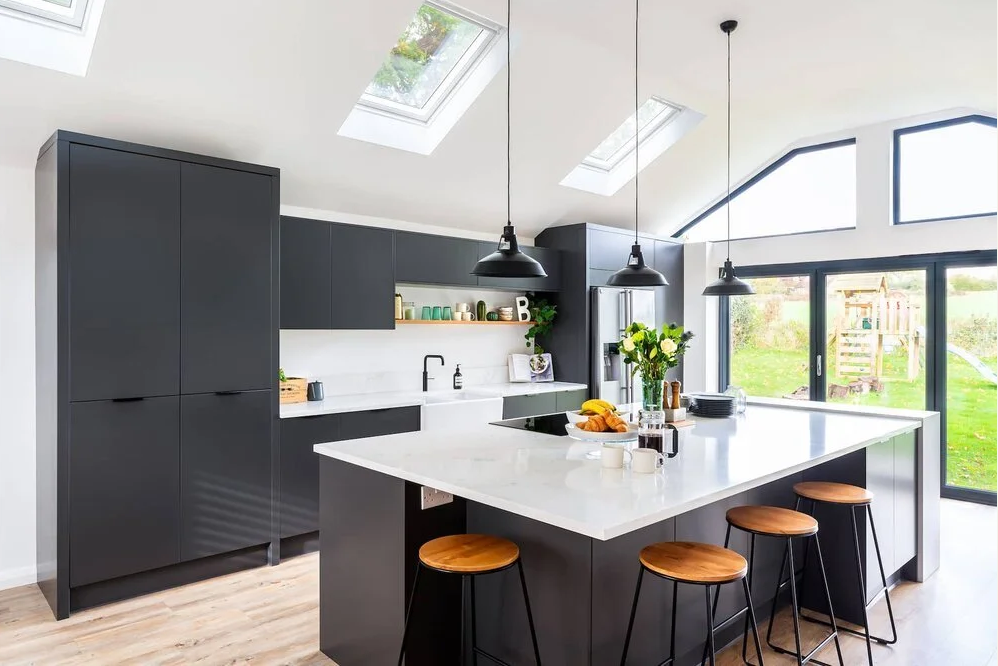
Grey and white have been dominant kitchen colours for well over a decade, and there is a straightforward reason they have stayed there: they work. Both palettes are adaptable across very different home styles, they age gracefully, and they appeal broadly to future buyers if you ever come to sell. That does not mean every grey or white kitchen looks the same. Far from it. The shade you choose, the finish, the hardware and the materials you pair with them produce wildly different results. This guide pulls together grey kitchen ideas and white kitchen ideas from real Kitchen Store projects so you can see how the choices play out in actual homes.
Modern Grey Kitchen Ideas
When people say they want a modern grey kitchen, they usually mean something that feels cool, clean and considered rather than cold or corporate. Getting there is partly about the shade and partly about what you put with it.
Handleless and graphite: the confident end of the spectrum
Darker greys, anthracite, graphite, deep charcoal, are having a sustained moment in contemporary fitted kitchens. They work particularly well in handleless designs, where the routed J-pull or push-to-open mechanism keeps the sightline uninterrupted across the face of the cabinetry. The result is a kitchen that reads as one continuous, architectural surface rather than a collection of individual doors. Our Calm Modern Grey Kitchen in Hove is a strong example of how a deep handleless grey can feel genuinely calm rather than oppressive when it is paired with the right worktop and lighting. It is a Nolte-based design with a matt grey slab front, a light quartz worktop and warm pendant lighting above the island, and the combination prevents the grey from reading as heavy.
Stopping grey from feeling cold
This is the question clients ask most often about grey kitchens, and the answer is always the same: warmth comes from the materials you pair with it, not from softening the grey itself. Three reliable approaches:
Introduce wood. An oak-veneered island, open shelving in a warm timber, or a woodgrain tall unit alongside painted grey base units breaks up what would otherwise be an entirely cool palette. The contrast is immediate and effective.
Choose warm-toned hardware. Brushed brass or aged brass handles and tap fittings add warmth at a relatively modest cost and change the entire register of the kitchen. Matte black is a cooler alternative that suits more urban, pared-back schemes.
Get the lighting right. Recessed warm-white LEDs and a statement pendant above the island or dining table do more to make a grey kitchen feel inviting than almost any material choice. Cool daylight bulbs in a grey kitchen are a mistake.
Light Grey and Greige Kitchen Ideas for a Softer Look
Not every grey kitchen needs to make a statement. For homeowners who want a calm, neutral palette that works with natural light and organic materials, light grey and greige (the grey-beige hybrid that has quietly become one of the most popular kitchen shades of the past few years) are worth serious consideration. These tones sit comfortably alongside painted shaker doors, which are a natural fit in older properties and in the kind of classic British kitchen designs produced by makers like Masterclass. See our range of British kitchens for how these softer tones perform in period homes.
Cashmere, stone, dove and soft linen shades sit in this category. They read as warm whites in strong natural light and as pale greys in the evening, which makes them particularly forgiving in rooms with variable light. Pairing them with an unlacquered oak or a brushed brass fitting keeps the warmth in the palette without tipping into something that feels country-kitchen by default.
Worktops in this context tend to work best in natural stone or a convincing porcelain slab in a marble or limestone pattern, keeping the material palette cohesive rather than introducing strong contrast.
White and Off-White Kitchen Ideas
White kitchens are perennially popular for a reason: they make the most of available light, they create a sense of space in smaller rooms, and they provide the cleanest possible backdrop for other materials to do their work.
Crisp white and gloss: the classic combination
A high-gloss white kitchen in a purpose-built or post-war property with good ceiling height and strong natural light is genuinely striking. Gloss reflects light back into the room and makes a smaller kitchen feel larger than it is. The trade-off is maintenance: gloss finishes show fingerprints and watermarks readily and need more frequent wiping down than matt. In a busy family kitchen this matters. If the look appeals but the upkeep does not, a silk or satin finish gives a similar lightness without being quite as demanding. Our range of contemporary German kitchens includes several white and off-white options that balance the clean aesthetic with practical, durable construction.
Off-white, cream and warm white
Pure white is not always the right answer. In a room with warm wood flooring, exposed brick or south-facing light that shifts colour through the day, a slightly warm white, cream, linen or bone, often reads better than a cold, blue-toned white. The risk with pure white in a warm-toned room is that it ends up looking cheap or clinical rather than clean. Hold samples against your floor and worktop before committing.
Grey and White Together, and Grey with Wood
Two-tone grey and white schemes
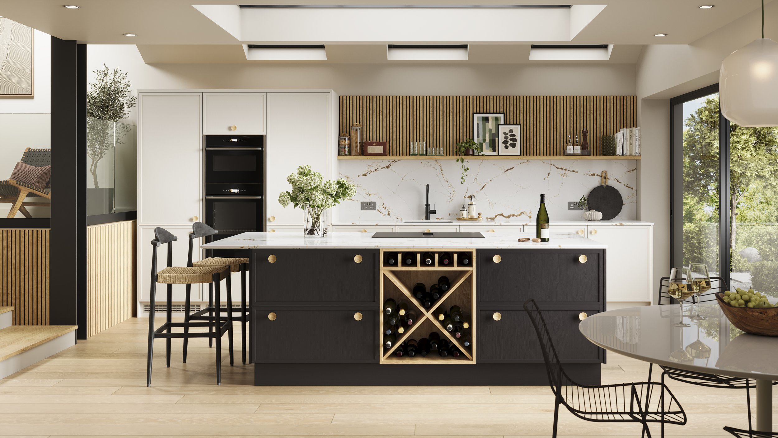
Combining grey base units with white wall units or a white island is one of the most practical two-tone approaches in kitchen design. It grounds the lower half of the kitchen visually while keeping the upper half light, which matters particularly in north-facing or narrower rooms. The key is committing to the ratio rather than splitting it evenly: a kitchen that is predominantly grey with white uppers reads as deliberate; one that is fifty-fifty can look indecisive. Generally, the stronger colour on the base units and the lighter on the wall units is the more reliable direction.
White or near-white worktops in quartz or porcelain link the two tones together and prevent the join from feeling abrupt. A white splashback, either large-format tile or a porcelain slab, extends the lighter tone through the room.
Grey and wood: the combination that keeps growing
Grey cabinetry paired with natural wood, whether that is an oak worktop, open shelving in a warm timber, or a woodgrain island front alongside painted grey units, is one of the most consistently successful pairings in contemporary kitchen design. The grey provides the structure and the wood provides the warmth that stops the kitchen from feeling corporate. The proportions matter: wood used as an accent (a shelf, an island end panel, a tall larder front) tends to read better than a full 50/50 split between grey and wood across every surface.
How to Choose the Right Grey or White for Your Room
The shade that looks right in a showroom or on a screen will not always look right in your kitchen, because light is the variable that changes everything. Here are the practical considerations.
North-facing rooms: avoid cool blue-toned greys and pure whites, which can look flat and slightly dingy in low natural light. Move toward warmer greiges, cashmere tones or warm white for a more inviting result.
South-facing rooms: almost any shade works, but cool greys and crisp whites are at their best here because strong natural light stops them from reading as cold.
Room size: lighter shades and matt finishes make smaller kitchens feel more open. Gloss reflects light and adds a sense of depth. Dark greys and graphite work best in larger rooms or where the ceiling height is generous.
Worktop and floor pairings: get samples of your shortlisted door finishes and hold them against your worktop and floor materials in the actual room. The way three or four materials interact in your specific light is something no screen or brochure can replicate.
This is also where a design consultation becomes genuinely useful. At our showrooms in Brighton and Hove, Horsham and Guildford you can see full-size grey and white kitchens in a real setting, with real lighting, and hold samples next to the worktop materials and handles you are considering. That comparison is the one that actually settles the decision.